Choosing the right color palette for your home is one of the most important decisions in interior design—and also one of the most personal. Colors affect how a space feels, how big or small it looks, and even how relaxed or energized you feel inside it. In modern homes, where comfort, style, and functionality must work together, the right color choices can completely transform everyday living.
Whether you’re decorating a new house, refreshing a rented apartment, or simply updating one room, learning how to choose the right color palette for your home will help you create spaces that feel balanced, welcoming, and truly yours.
Why Choosing the Right Color Palette for Your Home Matters
Colors do more than decorate walls. They shape mood, influence emotions, and set the tone for how a room is used. A calm color palette can make a bedroom more restful, while a warm and lively palette can make a living room feel social and inviting.
In today’s lifestyle-focused homes, color also helps connect different rooms into one cohesive story. When chosen thoughtfully, a palette makes your home feel intentional rather than random.
The good news? You don’t need to be an interior designer or spend a big budget to get it right.
Start With How You Want Your Home to Feel
Before picking any colors, pause and think about the feeling you want in your home.
Ask yourself:
-
Do I want my home to feel calm and peaceful?
-
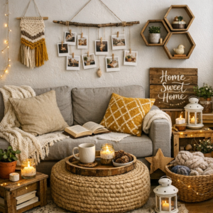
Do I prefer warm, cozy, and welcoming spaces?
-
Do I like bright, energetic, and modern interiors?
Your answers will guide every color decision.
For example:
-
Calm and relaxed homes often use soft neutrals, light blues, and muted greens.
-
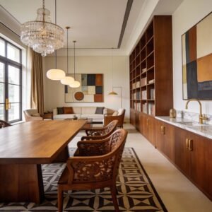
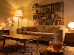
Warm and cozy spaces work well with beige, earthy browns, soft terracotta, and warm whites.
-
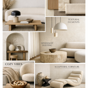
Fresh and modern interiors often feature clean whites, grays, and bold accent colors.
This emotional starting point makes choosing the right color palette for your home much easier.
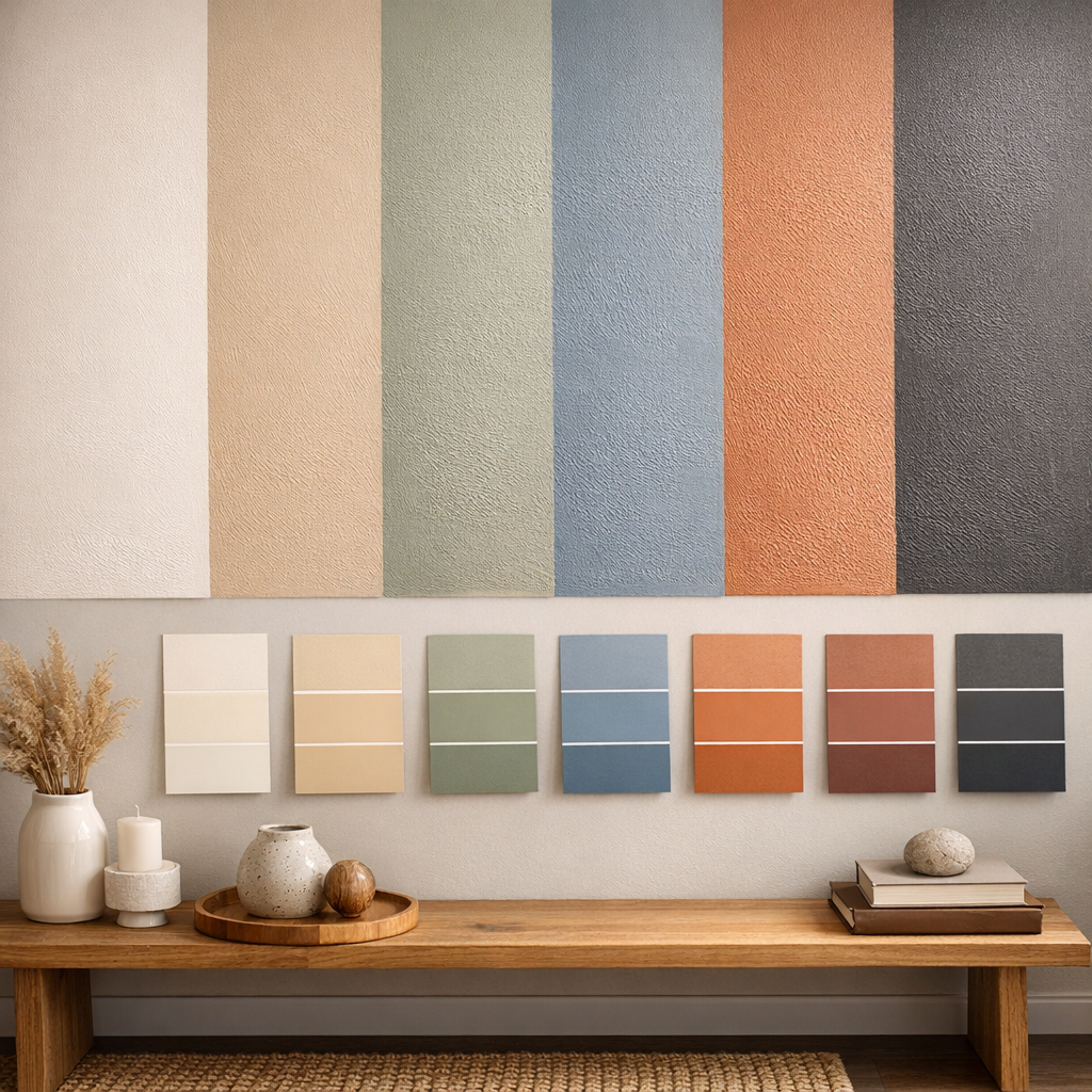
Understand the Basics of Color Families
You don’t need deep color theory, but understanding a few basics helps avoid mistakes.
Warm Colors
These include shades of red, orange, yellow, and warm neutrals. They create energy and comfort.
Best for:
-
Living rooms
-
Dining areas
-
Kitchens
Cool Colors
Blues, greens, and cool grays feel calming and fresh.
Best for:
-
Bedrooms
-
Bathrooms
-
Study spaces
Neutrals
White, beige, gray, and soft taupe act as a foundation.
Best for:
-
Walls throughout the home
-
Small rooms
-
Homes where furniture and décor add color
Neutrals are especially beginner-friendly and budget-friendly because they age well and are easy to update.
Let Natural Light Guide Your Color Choices
Light changes everything. The same color can look completely different depending on sunlight and artificial lighting.
-
Rooms with lots of natural light can handle darker or richer colors without feeling heavy.
-
Low-light rooms look better with light, reflective shades that keep the space open.
Notice how sunlight moves through your room during the day. Morning light feels cool, while evening light feels warm. Always test colors on your wall and observe them at different times before finalizing.
This simple step prevents one of the most common color regrets.
Use the 60-30-10 Rule for Balance
If you feel overwhelmed by mixing colors, this rule is a lifesaver.
-
60% – Main color (walls, large furniture)
-
30% – Secondary color (curtains, rugs, sofas)
-
10% – Accent color (cushions, art, décor)
For example, a living room might have soft beige walls (60%), warm gray furniture (30%), and muted green accents (10%). The result feels balanced, not busy.
This method works in any room and helps you choose the right color palette for your home with confidence.
Connect Rooms With a Cohesive Color Flow
Your home should feel connected, not like a collection of unrelated rooms.
This doesn’t mean every room must be the same color. Instead:
-
Use one neutral shade throughout the home.
-
Change accent colors from room to room.
-
Repeat similar tones in décor or textiles.
For example, a soft gray wall color can appear in the living room, hallway, and bedroom, while each room has its own accent color. This creates flow without boredom.
Use Furniture and Décor as Color Inspiration
If you already own furniture, artwork, or rugs you love, let them guide your palette.
Look closely at:
-
Sofa fabric
-
Cushions and throws
-
Wall art
-
Curtains or carpets
Pull 2–3 colors from these items and build your palette around them. This ensures your home feels harmonious instead of mismatched.
This approach is perfect for renters or anyone decorating on a budget.
Budget-Friendly Tips for Choosing the Right Color Palette for Your Home
You don’t need expensive paint or designer help to create a beautiful color scheme.
Try these smart ideas:
-
Paint walls neutral and add color through cushions and accessories.
-
Use removable wallpaper or wall art for accent colors.
-
Refresh a room by changing curtains instead of repainting.
-
Add plants to bring in natural green tones.
Small changes can completely shift the look and feel of a room.
Modern Color Trends That Still Feel Timeless
Trends are fun, but timeless choices keep your home looking good for years.
Some modern yet lasting ideas include:
-
Warm whites instead of bright white
-
Earthy tones like clay, sand, and olive
-
Soft pastels paired with neutrals
-
Deep accent colors like navy or forest green
Use trends in accents rather than main colors so your home doesn’t feel dated quickly.
Common Color Mistakes and How to Avoid Them
Even well-intentioned choices can go wrong. Here are a few common mistakes:
Choosing Colors Too Quickly
Always test samples on your wall and live with them for a few days.
Ignoring Lighting
A color that looks great in the store may look dull or harsh at home.
Using Too Many Bold Colors
Too many strong shades can make a space feel chaotic. Balance them with neutrals.
Forgetting the Floor and Ceiling
Floors, ceilings, and trim also affect how colors look. Always consider the full space.
Avoiding these mistakes makes choosing the right color palette for your home a smooth and enjoyable process.
How Color Can Change the Size and Mood of a Room
Color can visually shape a space:
-
Light colors make small rooms feel bigger.
-
Dark colors create intimacy in large rooms.
-
Vertical color contrast can make ceilings feel higher.
-
Soft, blended tones create calm and harmony.
Understanding this helps you use color as a design tool, not just decoration.
Trust Your Taste and Take It Step by Step
Trends, rules, and advice are helpful—but your comfort matters most. Your home should reflect your lifestyle, habits, and personality.
Start small:
-
Choose one room.
-
Pick one main color.
-
Build slowly with accents.
Confidence grows with experience, and every small decision teaches you more about your style.
Conclusion: Create a Home That Feels Right to You
Choosing the right color palette for your home isn’t about perfection—it’s about intention. When you understand light, balance, and mood, color becomes a powerful way to express yourself and improve daily living.
Take your time, test your choices, and don’t be afraid to adjust. With thoughtful planning and simple principles, your home can feel cohesive, comfortable, and beautifully personal.
Try one idea from this guide today, and let your home slowly transform into a space you truly love.
Frequently Asked Questions
1. How many colors should I use in one room?
Usually three: a main color, a secondary color, and an accent.
2. Are neutral homes boring?
Not at all. Texture, lighting, and accents add warmth and interest.
3. Can I mix warm and cool colors?
Yes. Balanced mixing often creates the most natural-looking spaces.
4. Should every room have a different color?
They can, but maintaining a common base color keeps the home cohesive.
5. What’s the safest color choice for beginners?
Soft neutrals like beige, warm gray, or off-white are easy and flexible.